
Related products – Design
AI Overview
Shows how to design the Related Products widget in Tipo Related Products, including layout, size, visible elements and colors. You work in the app's Design settings on the Related tab, and a live preview on the right updates instantly as you change each option.
View moreView less
- Open the app, then Settings > Design > Related tab.
- Choose a template: Carousel, Bundle, Table, List, Vertical or Slider.
- Set Maximum width, Number of products and Position.
- Turn elements on or off: Variant select, Sale label, Price, Add to cart button.
- Adjust colors for headings, text, sale label and button, and check the preview.
- Article suggests Carousel as a default and 4-8 products.
Summary generated by AI. It can make mistakes, so check the full guide below.
The Related products section in the design setting lets you control how your Related Products widget looks on your store.
You can choose the layout, adjust spacing and sizes, show or hide elements, and customize colors — all with live preview.
🛠️ How to find the setting
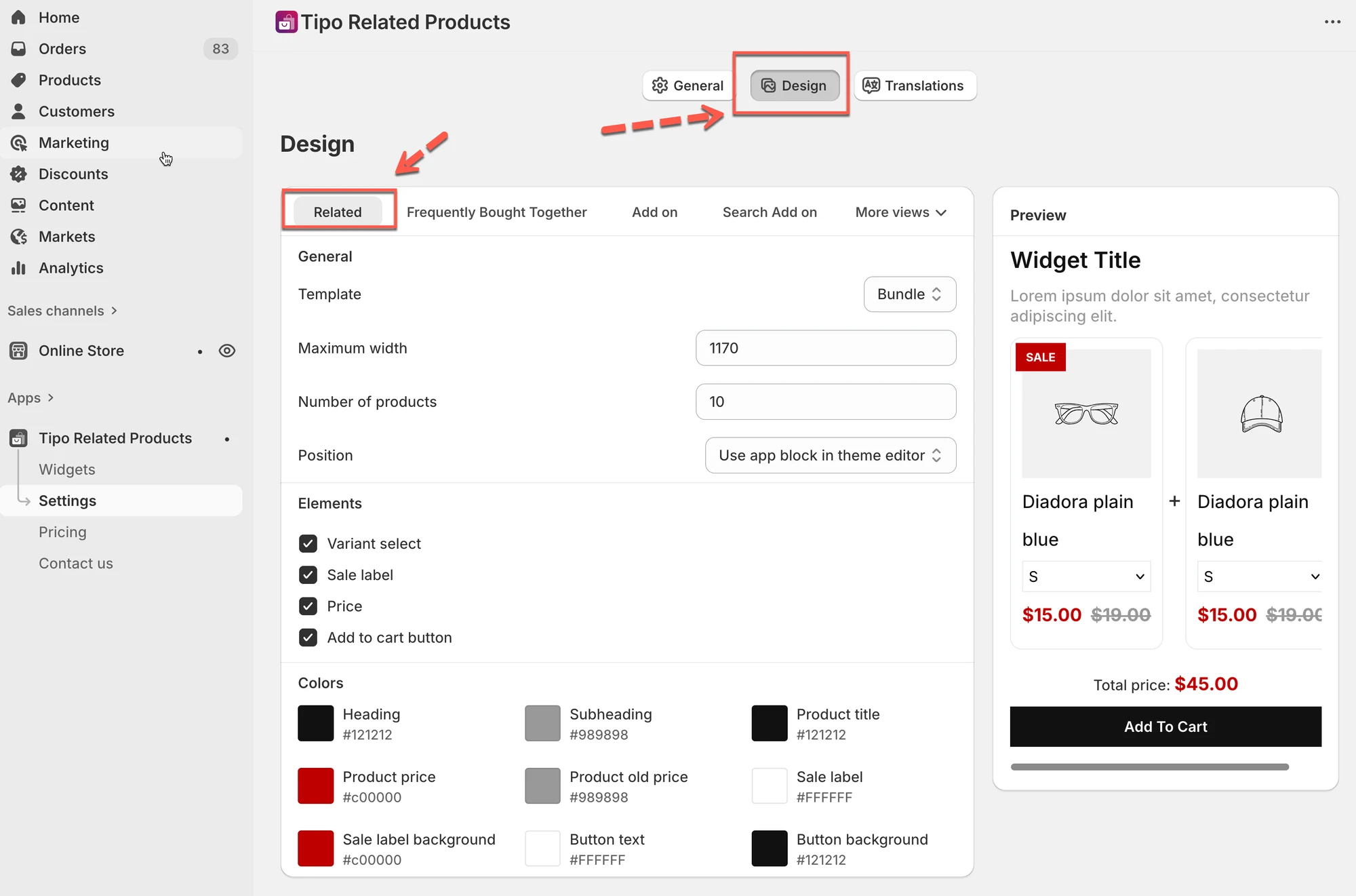
Section titled “🛠️ How to find the setting”Open the app > click Settings > Design > click on Related tab
You’ll see:
- Design settings on the left
- A live Preview on the right
Changes are shown instantly in the preview.
1) Choose a layout (Template)
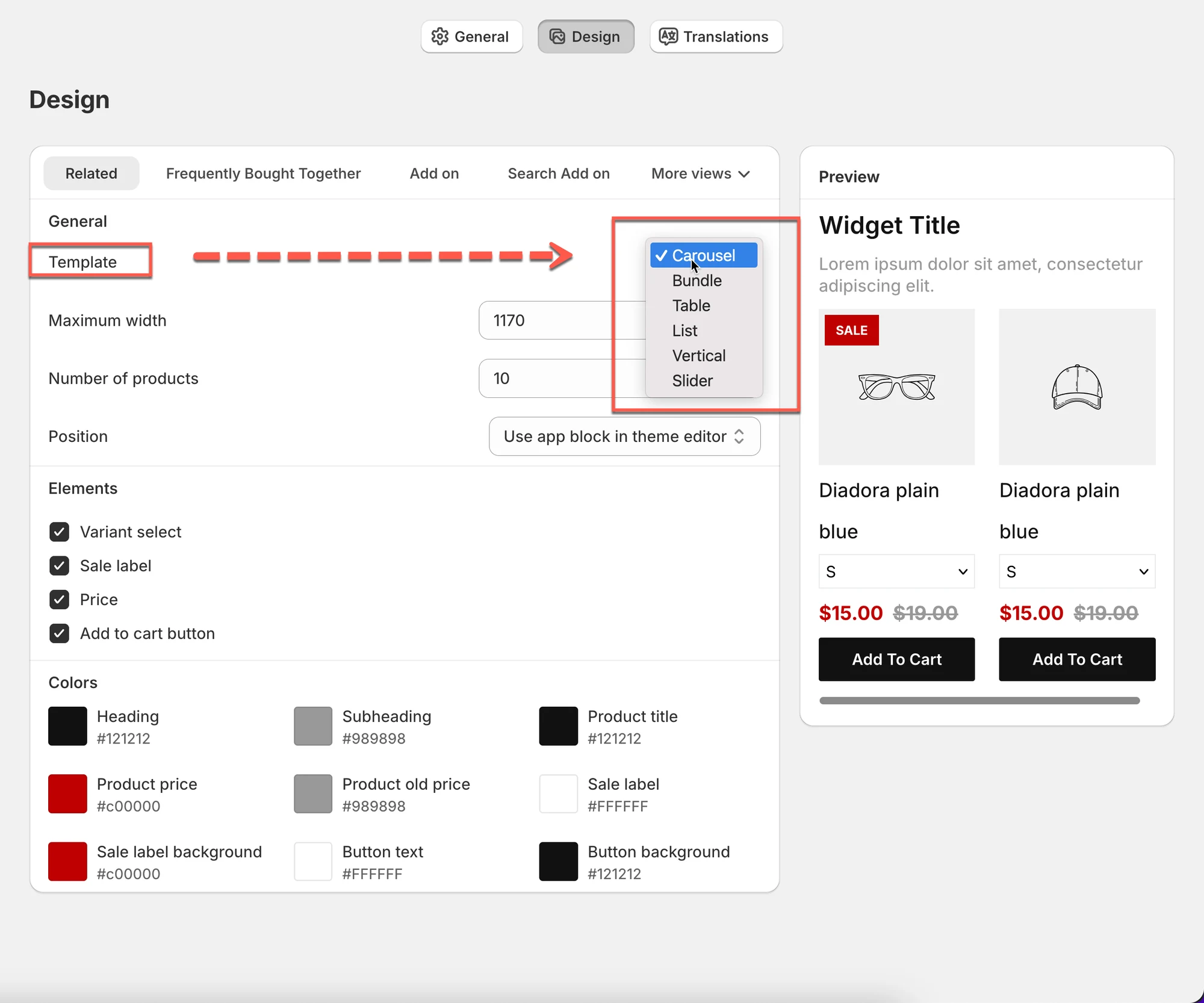
Section titled “1) Choose a layout (Template)”This controls how related products are displayed.
Available layouts
Section titled “Available layouts”- Carousel
Products scroll horizontally (best for product pages). - Bundle
Shows products grouped together (great for bundles or “buy together” offers). - Table
Compact, list-style layout (useful for many products). - List
Simple vertical list. - Vertical
Stacked cards, often used in sidebars. - Slider
Large sliding cards for visual impact.
Tip:
If you’re not sure, start with Carousel. It works well for most stores.
2. General layout settings
Section titled “2. General layout settings”Maximum width
Section titled “Maximum width”Controls how wide the widget can be.
- Example:
1170fits most desktop layouts. - Smaller values make the widget more compact.
Number of products
Section titled “Number of products”Sets how many related products are shown.
- Example:
10→ show up to 10 products. - Actual number shown may depend on layout and screen size.
Position
Section titled “Position”Defines where the widget appears.
- Use app block in theme editor (recommended)
- Or theme-specific placement options
3. Elements
Section titled “3. Elements ”Choose which product elements are visible:
- Variant select – show variant dropdowns (size, color, etc.)
- Sale label – show “Sale” badge
- Price – show product price
- Add to cart button – allow quick add
Example:
If you want a cleaner look, you can hide Variant select and only show the Add to cart button.
4. Color settings
Section titled “4. Color settings”Customize the widget to match your store’s branding.
You can change colors for:
- Heading
- Subheading
- Product title
- Product price
- Old price
- Sale label text
- Sale label background
- Button text
- Button background
All colors update instantly in the preview.
5. Live preview
Section titled “5. Live preview”The Preview panel on the right shows exactly how your widget will look on your store.
Use it to:
- Compare layouts
- Test colors
- Check spacing and readability
No need to save to see changes.
Example setup
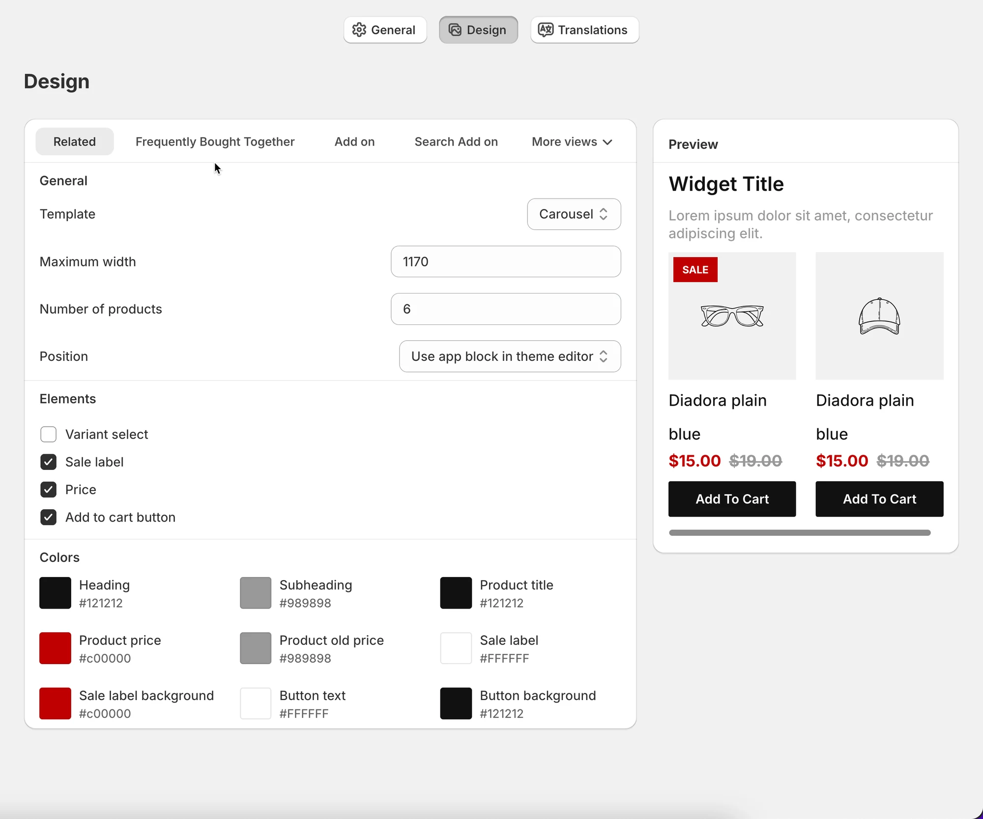
Section titled “Example setup”Goal: Clean related products carousel under product description
Recommended settings:
- Template: Carousel
- Maximum width:
1170 - Number of products:
6 - Enabled elements:
- Price
- Sale label
- Add to cart button
- Colors: Match your theme’s primary colors
Result:
A modern, scrollable related products section that blends seamlessly with your store.
Tips & best practices
Section titled “Tips & best practices”- Keep the number of products between 4–8 for best conversion
- Use Carousel for product pages, List/Table for sidebars
- Match button and text colors with your theme for consistency
- Always check the preview before saving
🙋 Still need support?
If you still need help, please feel free to contact us at hi@tipo.io. We’ll be happy to assist you further.