
Recently viewed products – Design
AI Overview
Shows how to design the Recently Viewed Products widget in Tipo Related Products, which lets customers return to items they viewed earlier. You set the template, size, position, visible elements and colors in Design settings, and the preview updates instantly. Click Save to apply your changes.
View moreView less
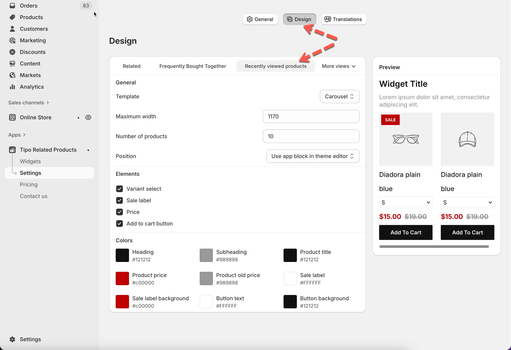
- Open the app, then Settings > Design > Recently viewed products tab.
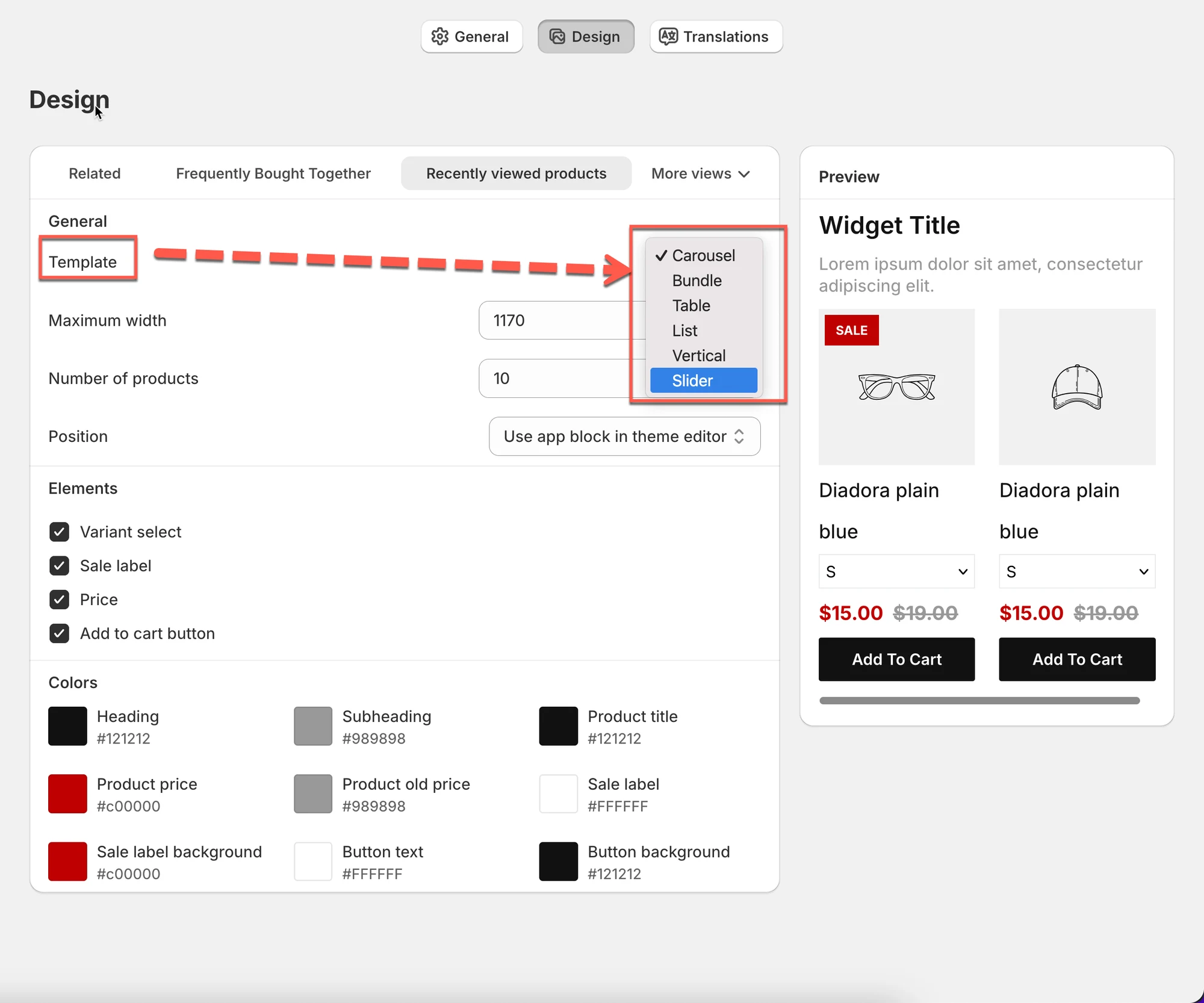
- Choose a template, such as Carousel or List.
- Set Maximum width and Number of products; fewer may show on mobile.
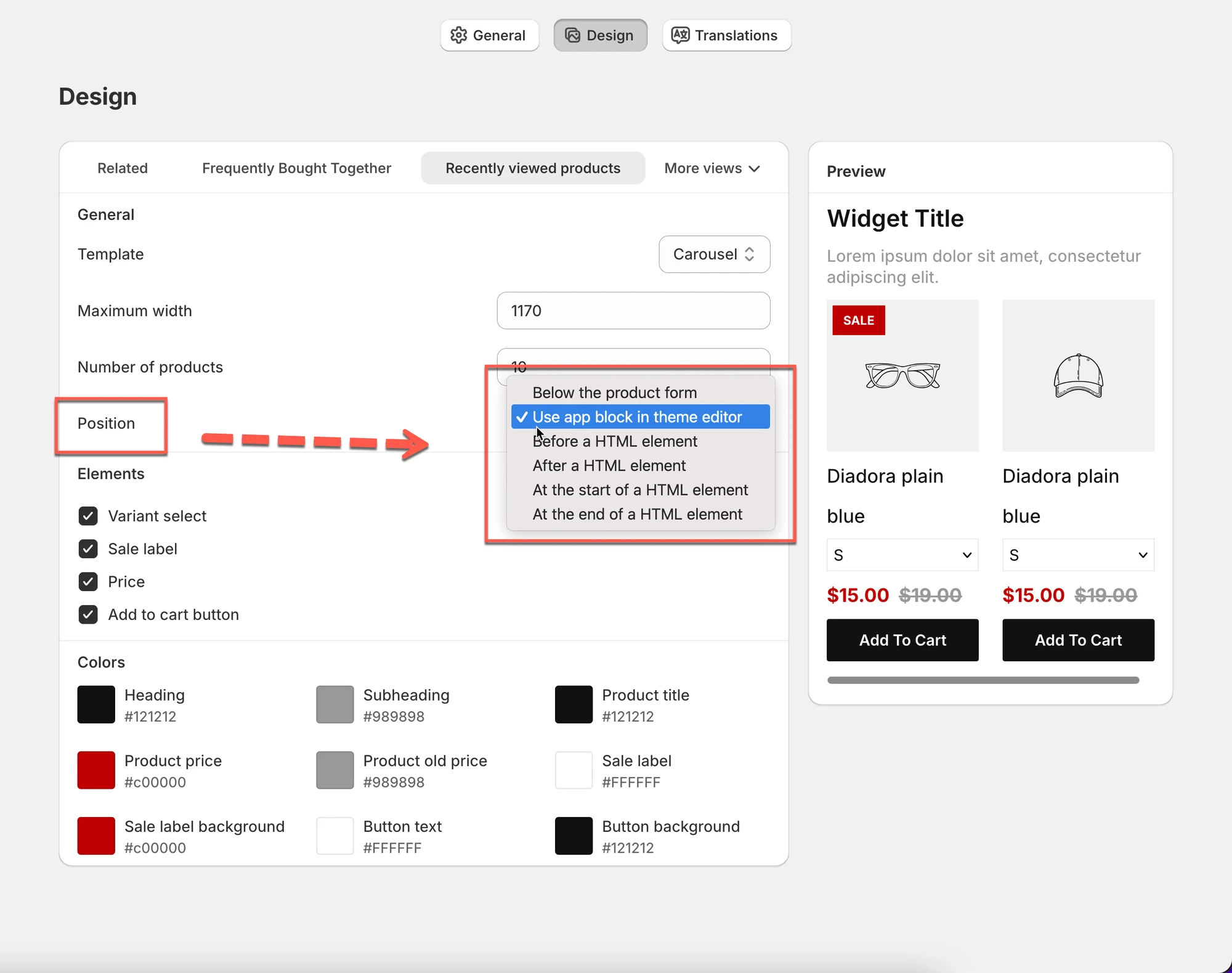
- Choose a Position; the app block in the theme editor is recommended.
- Turn product elements on or off and match colors to your theme.
- Click Save in the top-right corner to apply changes.
Summary generated by AI. It can make mistakes, so check the full guide below.
The Recently Viewed Products widget shows items a customer has viewed before, helping them quickly return to products they’re interested in.
All design changes are shown instantly in the preview on the right.
🛠️ How to find the setting
Section titled “🛠️ How to find the setting”Open the app > click Settings > Design > click on Recently viewed products tab
You’ll see:
- Design settings on the left
- A live Preview on the right
Changes are shown instantly in the preview.
1) Choose a layout (Template)
Section titled “1) Choose a layout (Template)”The Template controls how the recently viewed items are displayed.
Common templates:
- Carousel (scroll horizontally)
- List (stack vertically)
- Table / Vertical / Slider (depending on your theme and widget style)
Tip: Carousel works best on product pages because it’s compact and easy to browse.
2) Set the widget size
Section titled “2) Set the widget size”Maximum width
Section titled “Maximum width”Controls how wide the widget can be on desktop.
- Example: 1170 fits most themes.
- Lower values make it more compact.
Number of products
Section titled “Number of products”Controls how many recently viewed products to show.
- Example: 10 = show up to 10 items
⚠️ Note: The number shown can be smaller on mobile or depending on the layout.
3) Choose where the widget appears (Position)
Section titled “3) Choose where the widget appears (Position)”Position controls where the widget is placed in your theme.
Common options:
- Use app block in theme editor (recommended)
- Other placement options may appear depending on your theme
Tip: Use app block in theme editor for the easiest setup and best compatibility.
4) Choose what shoppers can see (Elements)
Section titled “4) Choose what shoppers can see (Elements)”Turn on/off the content shown for each product card.
Common options:
- Variant select (show variant dropdown)
- Sale label (show SALE badge)
- Price
- Add to cart button
✅ Recommended setup:
- Product page: enable Price + Add to cart
- Small areas (sidebar/cart): consider turning off Variant select to keep it clean
5) Match your store style (Colors)
Section titled “5) Match your store style (Colors)”Use Colors to control the widget’s look:
- Heading / Subheading
- Product title
- Product price / old price
- Sale label + background
- Button text + background
Tip: Match your theme’s button colors so the widget looks like part of your store.
6) Check the Preview
Section titled “6) Check the Preview”On the right, the Preview updates instantly as you change settings.
Use it to confirm:
- layout looks correct (carousel vs list)
- text is readable
- buttons and price are visible
💾 Save changes
Section titled “💾 Save changes”Click Save in the top-right corner to apply your design updates.
🙋 Still need support?
If you still need help, please feel free to contact us at hi@tipo.io. We’ll be happy to assist you further.