
Add-on widgets – Design
AI Overview
Describes how to design Add-on widgets in Tipo Related Products. Add-ons are upsell recommendations shown on places such as the homepage, search, collection pages and the cart. Each Add-on view has its own design settings, with a live preview that updates as you edit.
View moreView less
- Open the app, then Settings > Design > Related tab.
- Click More views and choose an Add-on location, such as Homepage, Search, Collection or Cart Add on.
- Choose a template (Carousel is recommended) and set Maximum width, Number of products and Position.
- Turn elements on or off and customize colors.
- Each Add-on view is designed separately; check the Preview panel.
Summary generated by AI. It can make mistakes, so check the full guide below.
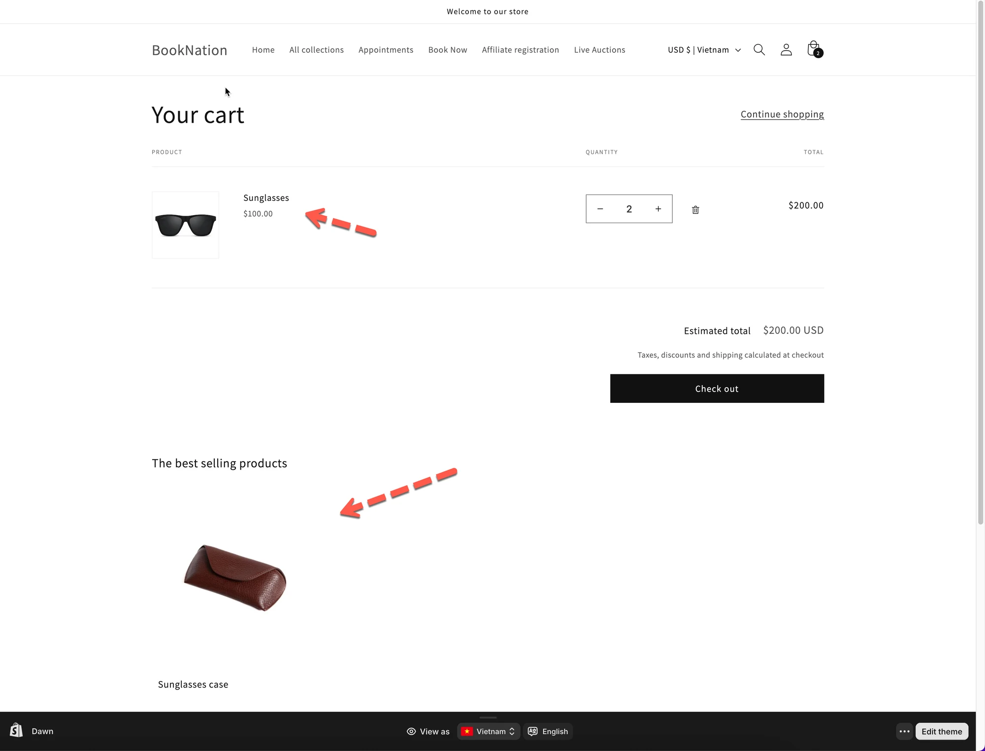
Add-on layouts help you show extra products (upsells) in different places, such as product pages, search results, collections, or the cart.
This guide explains how to choose and design Add-on layouts.
💡 What are Add-on layouts?
Section titled “💡 What are Add-on layouts?”Add-on layouts are recommendation widgets used to encourage customers to add more items before checkout.
Common use cases:
- “You may also like”
- “Add this item”
- Upsells on product, cart, or search pages
You can design each Add-on layout separately.
🛠️ Where to find the setting
Section titled “🛠️ Where to find the setting”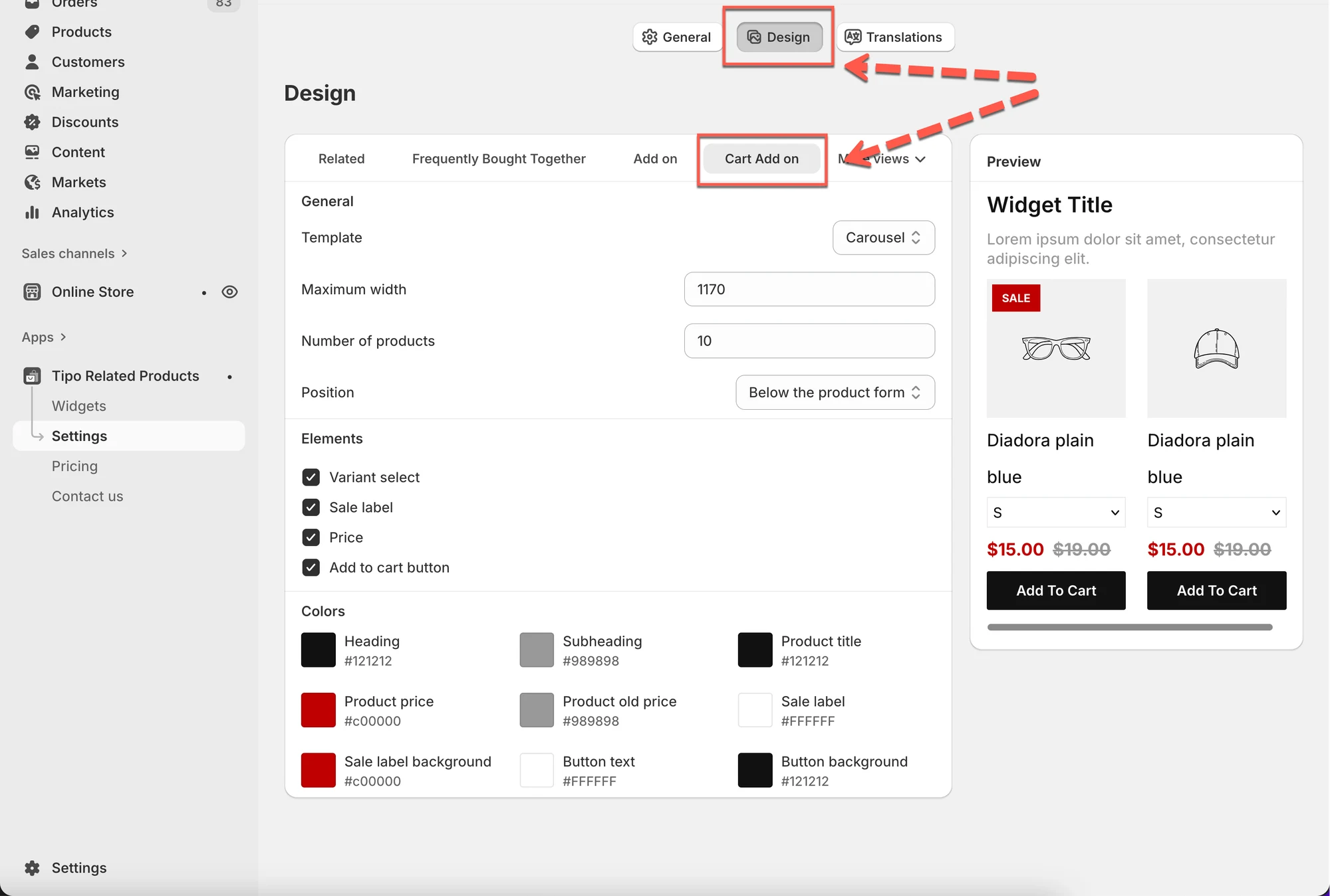
Open the app > click Settings > Design > click on Related tab
You’ll see:
- Design settings on the left
- A live Preview on the right
Changes are shown instantly in the preview.
1) Choose where the Add-on appears
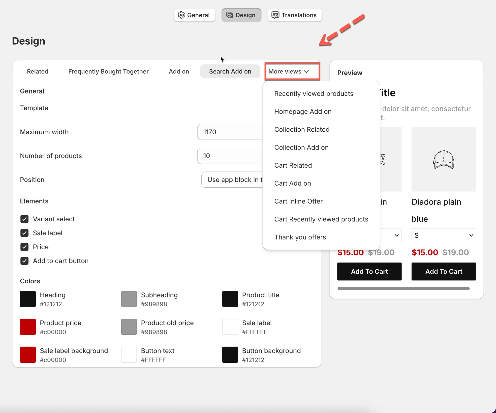
Section titled “1) Choose where the Add-on appears”Click More views to choose the Add-on location.
Available Add-on views include:
- Homepage Add on – show Add-ons on the homepage
- Search Add on – show Add-ons on search result pages
- Collection Add on – show Add-ons on collection pages
- Cart Add on – show Add-ons inside the cart
- Cart Inline Offer – inline offers inside cart items
- Thank you offers – offers after checkout
- Cart Recently viewed products – based on browsing history
Each view has its own design settings.
2) Choose a layout (Template)
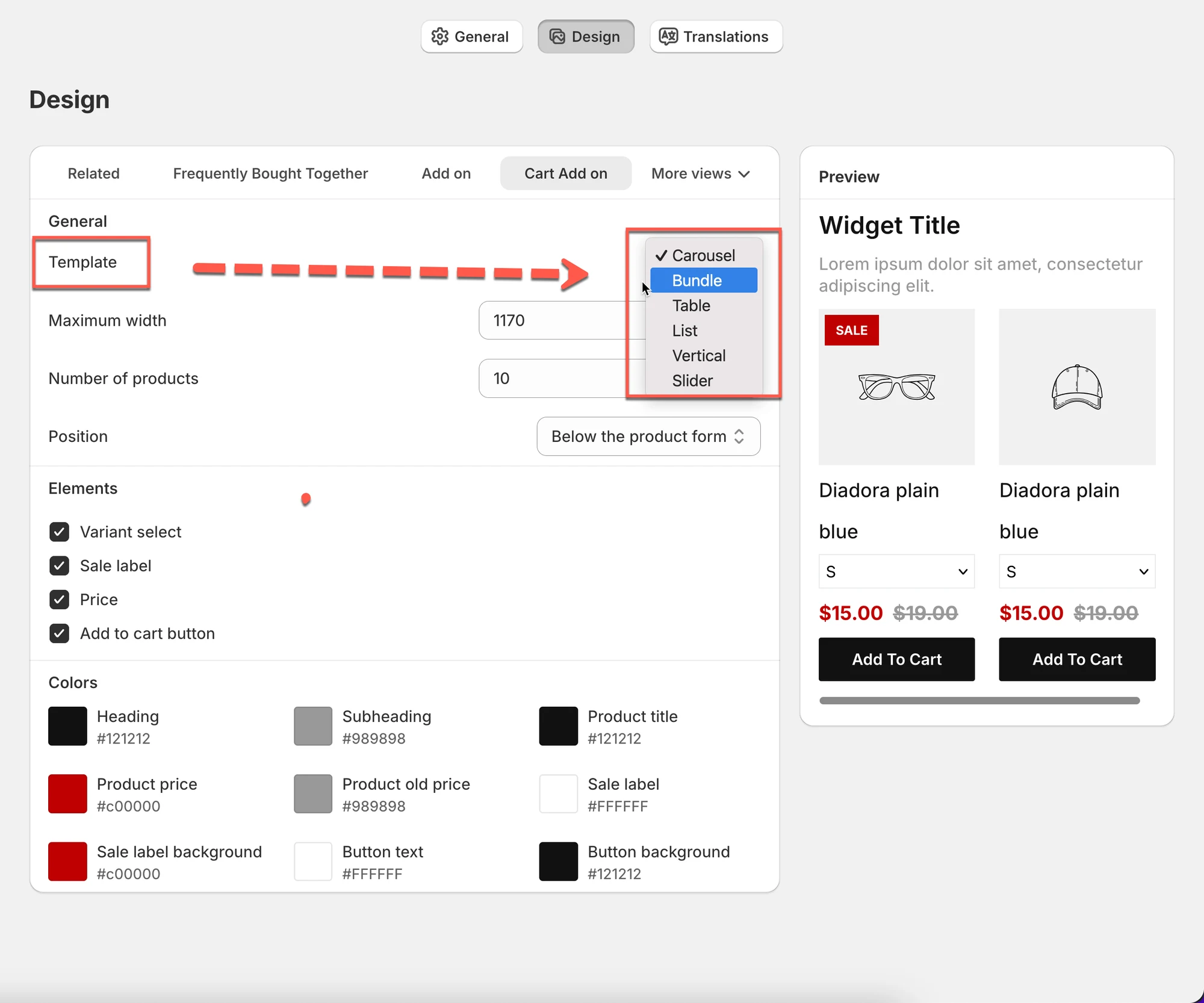
Section titled “2) Choose a layout (Template)”Select how Add-on products are displayed.
Available templates:
- Carousel – horizontal scrolling products (recommended)
- Bundle – products grouped together (great for upsells)
- Table – compact list view
- List – simple vertical list
- Vertical – stacked cards
- Slider – large sliding cards
Tip:
Start with Carousel if you’re not sure, it works well in most cases.
3) Adjust general layout settings
Section titled “3) Adjust general layout settings”Maximum width
Section titled “Maximum width”- Controls how wide the Add-on widget is
- Example:
1170fits most desktop layouts
Number of products
Section titled “Number of products”- Sets how many Add-on products are shown
- Example:
10→ show up to 10 products
Position
Section titled “Position”- Choose where the widget appears, such as:
- Use app block in theme editor
- Before / after HTML elements
4) Choose visible elements
Section titled “4) Choose visible elements”You can turn elements on or off:
- Variant selector
- Sale label
- Price
- Add to cart button
Disable elements to keep the layout clean and simple.
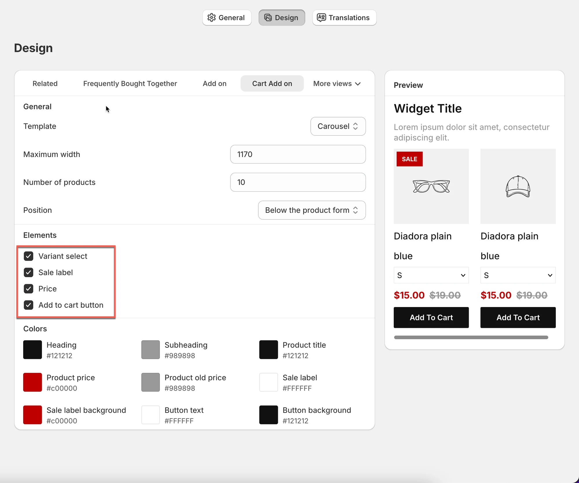
5) Customize colors
Section titled “5) Customize colors”Control the look of the Add-on widget:
- Heading color
- Subheading color
- Product title color
- Price & old price color
- Sale label background
- Button text & background
6) Preview your design
Section titled “6) Preview your design”Use the Preview panel on the right:
- See changes instantly
- Test different templates and colors
- Make sure it fits your store’s design
✅ Best practices
Section titled “✅ Best practices”- Use Carousel or Bundle for upsells
- Keep Add-on widgets simple and visible
- Match colors with your theme
- Limit product count to avoid clutter
🙋 Still need support?
If you still need help, please feel free to contact us at hi@tipo.io. We’ll be happy to assist you further.